Background
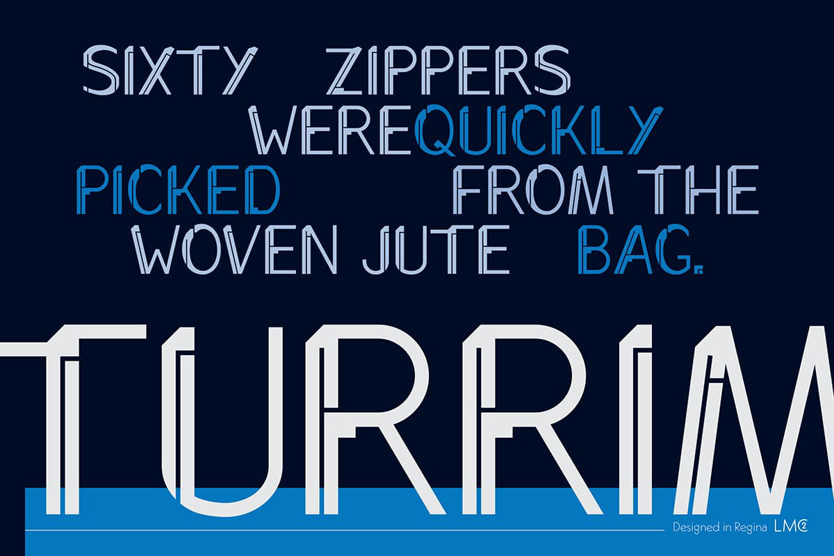
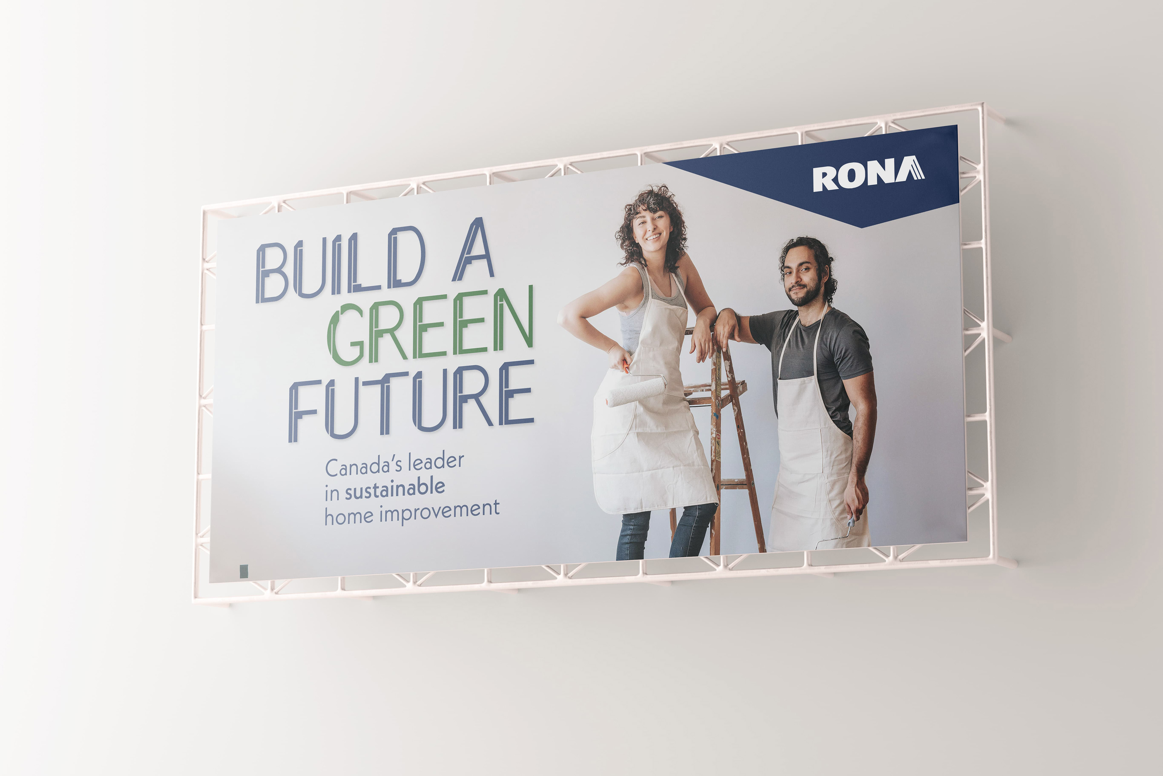
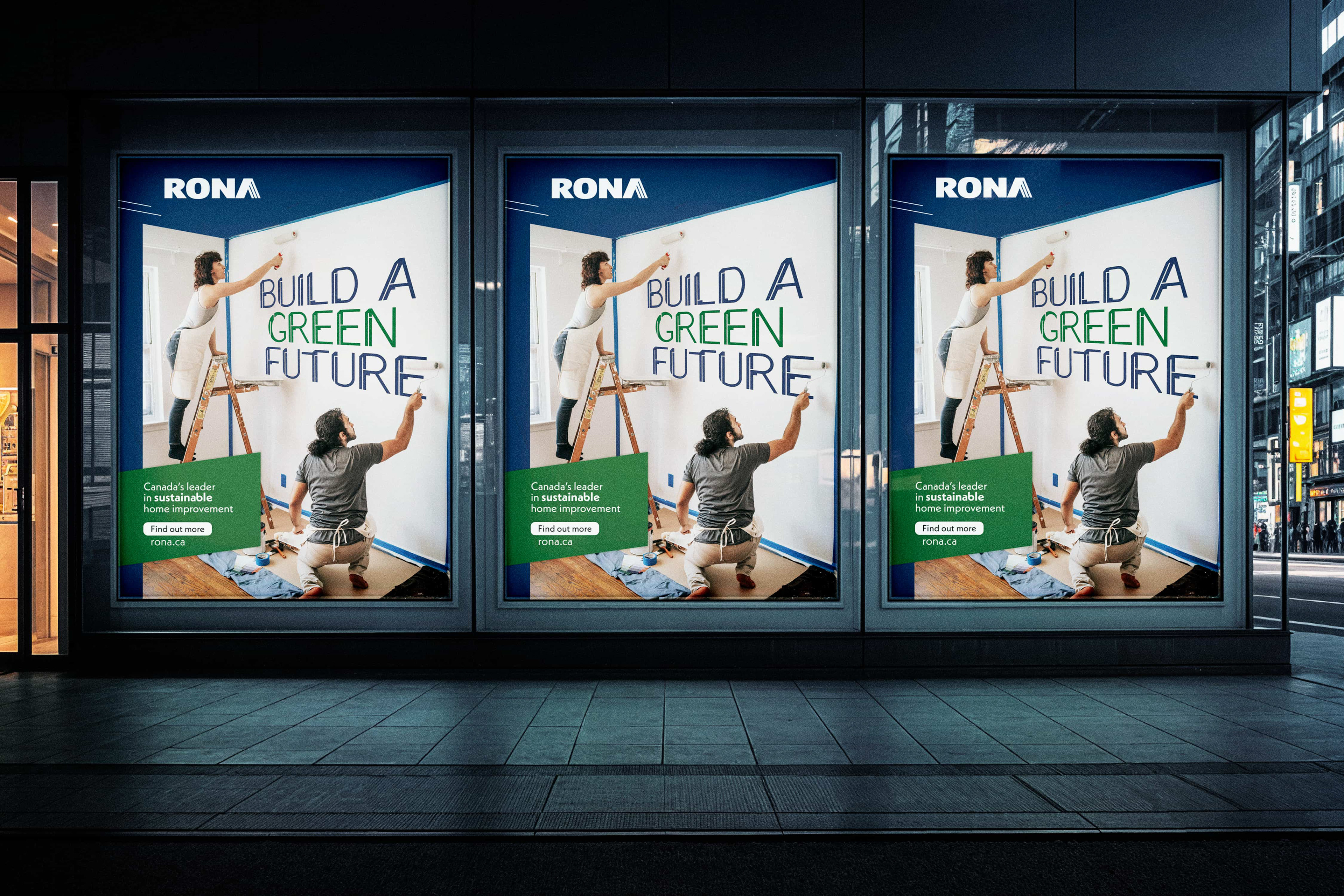
This was an assignment to create a custom typeface. I needed to come up with inspiration and develop a full character set, with numbers and basic punctuation. Then I chose a business to "partner" with and created a fictional advertising campaign to showcase our typeface.
Challenge
The challenge for this project was creating precise and consistent letter forms. Because I decided to create a geometric sans serif typeface, making sure the letters were (relatively) the same size and had the same visual consistency was key to ensuring a cohesive feel for the typeface.
Process
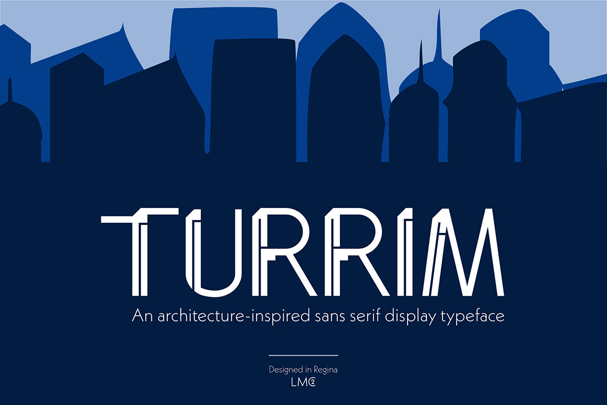
I wanted to create a geometric sans serif typeface based on modern architecture. I selected a few distinct shapes and themes I wanted to use. Then it was a matter of creating all the letter forms, which was a multiple week process that required a lot of attention to detail to ensure consistency. The name Turrim is Latin for 'the tower.'
Results
I accomplished what I set out to do and created a functional and stylish geometric sans serif that incorporates elements of modern architecture. I think there is really good consistency across the letter forms and all the pieces feel like they belong together.