Background
For this assignment I needed to create a cover design and four internal spreads for Canadian Geographic. I was supplied the copy and images for the project and then needed to design the cover and spreads to meet the expectations of Canadian Geographic's readers, which was outlined in a creative brief.
Challenge
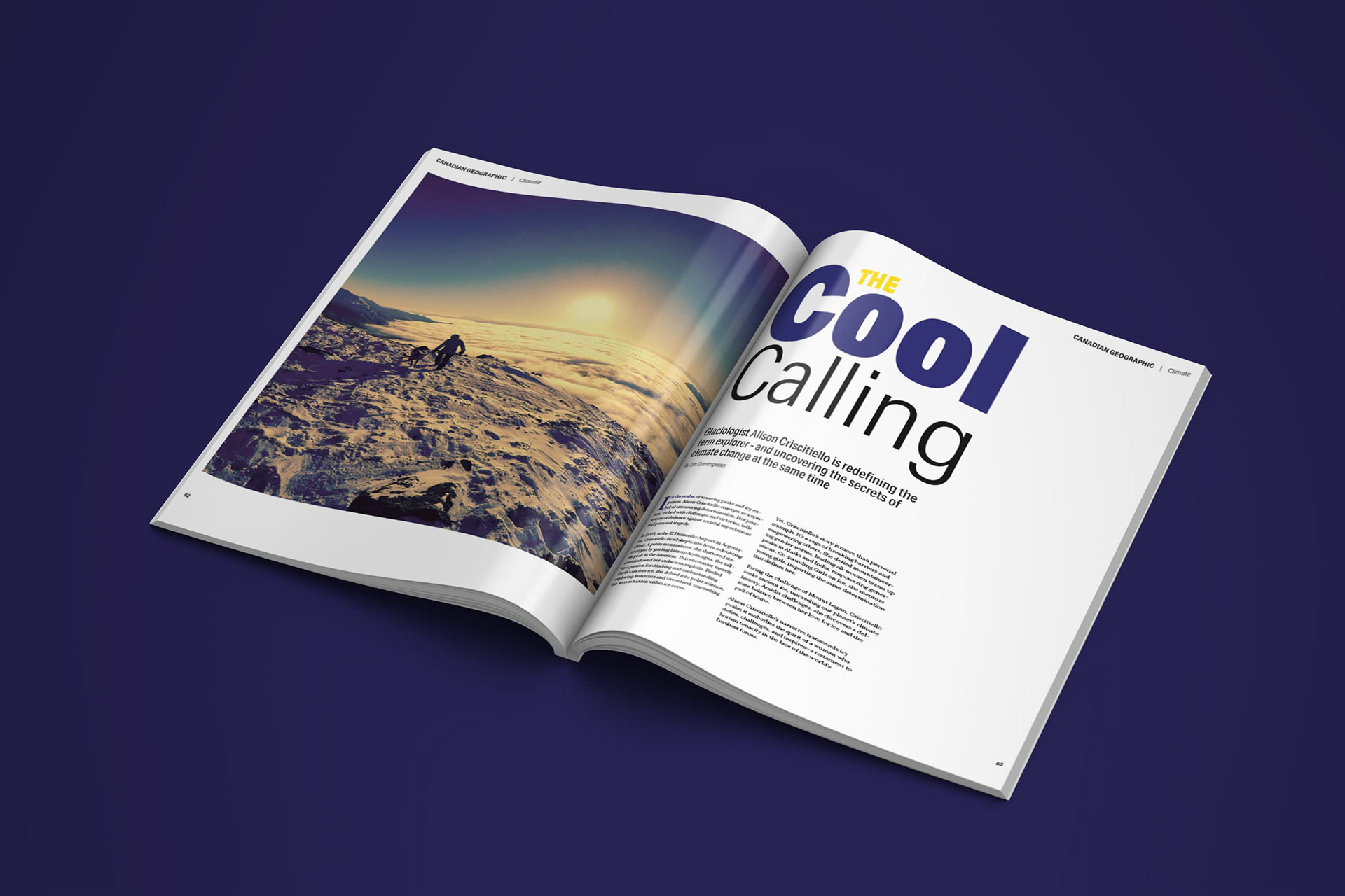
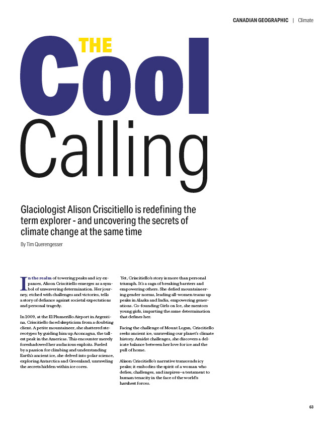
The biggest challenge was arranging and balancing the copy on each of the magazine spreads. It becomes a puzzle you need to solve; trying to fit and balance the copy along with images on a given spread. And while it is a challenge, the problem-solving aspect of editorial design is something I really enjoy.
Process
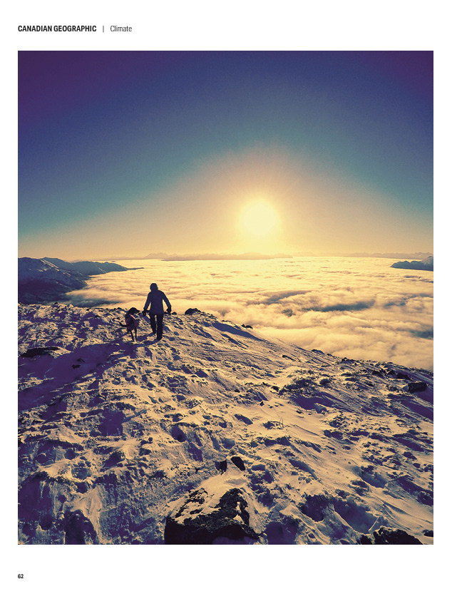
I created a grid system to organize the elements in the internal spreads and then added the body copy to see where it made sense to put the images.
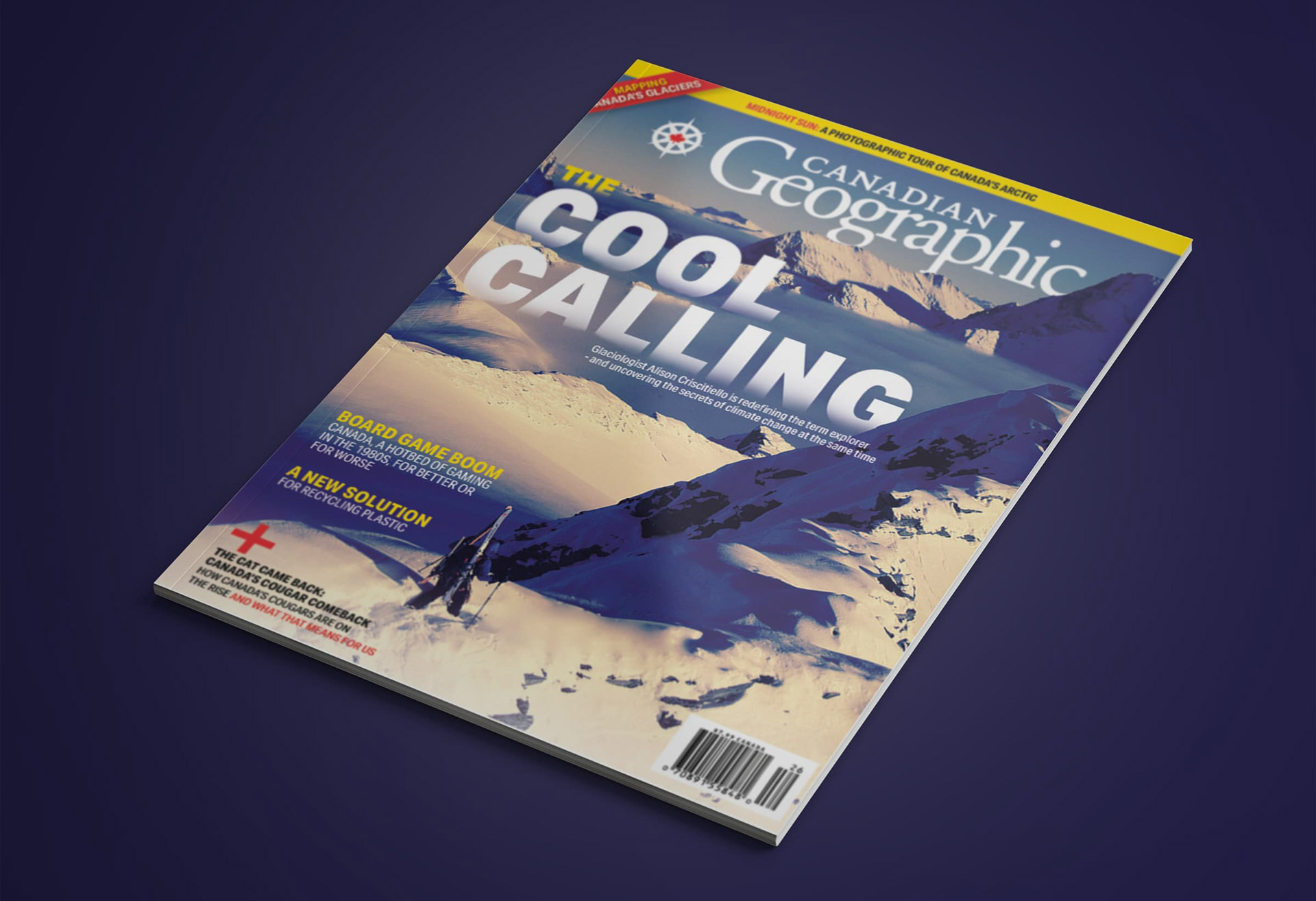
Because there is so much depth and scale in the cover image, I wanted the text to sit in the mountain valley. I created a multi-layer version of the image in Photoshop and then manipulated the layers in InDesign to create the depth of the headline sitting in the clouds.
Results
I'm really happy with how this project tuned out - especially the cover. The cover design took a lot of work to fine tune the layer masking and create the depth, but I think it really paid off. It was a good experience to learn what goes into creating a balanced and appealing magazine spread.