Background
This was the final project for our packaging course. The fictional client, 'Buffalo Coffee', wanted to redesign their packaging to reflect their desire to move to a higher-end market, while still maintaining their hand-made feel.
Challenge
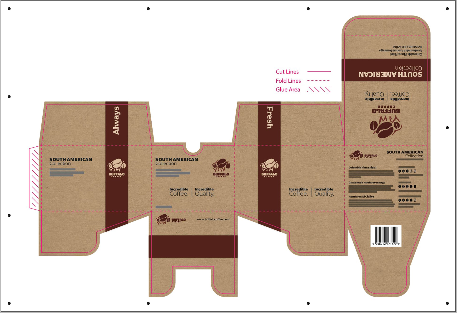
The difficulty for this project was the space limitation. Our package dieline had to fit on a 13"x19" artboard and we could only use two artboards. So the challenge was to design a package that could accommodate sample packs of coffee and still fit within the given dimensions.
Process
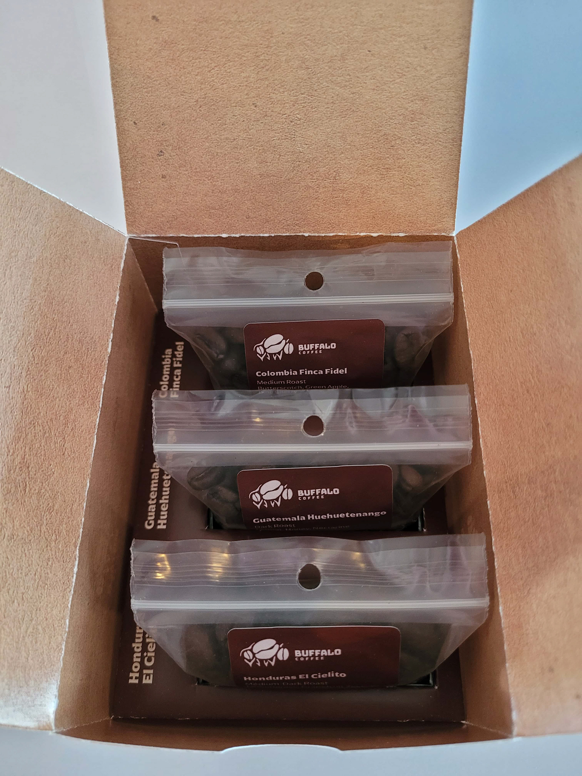
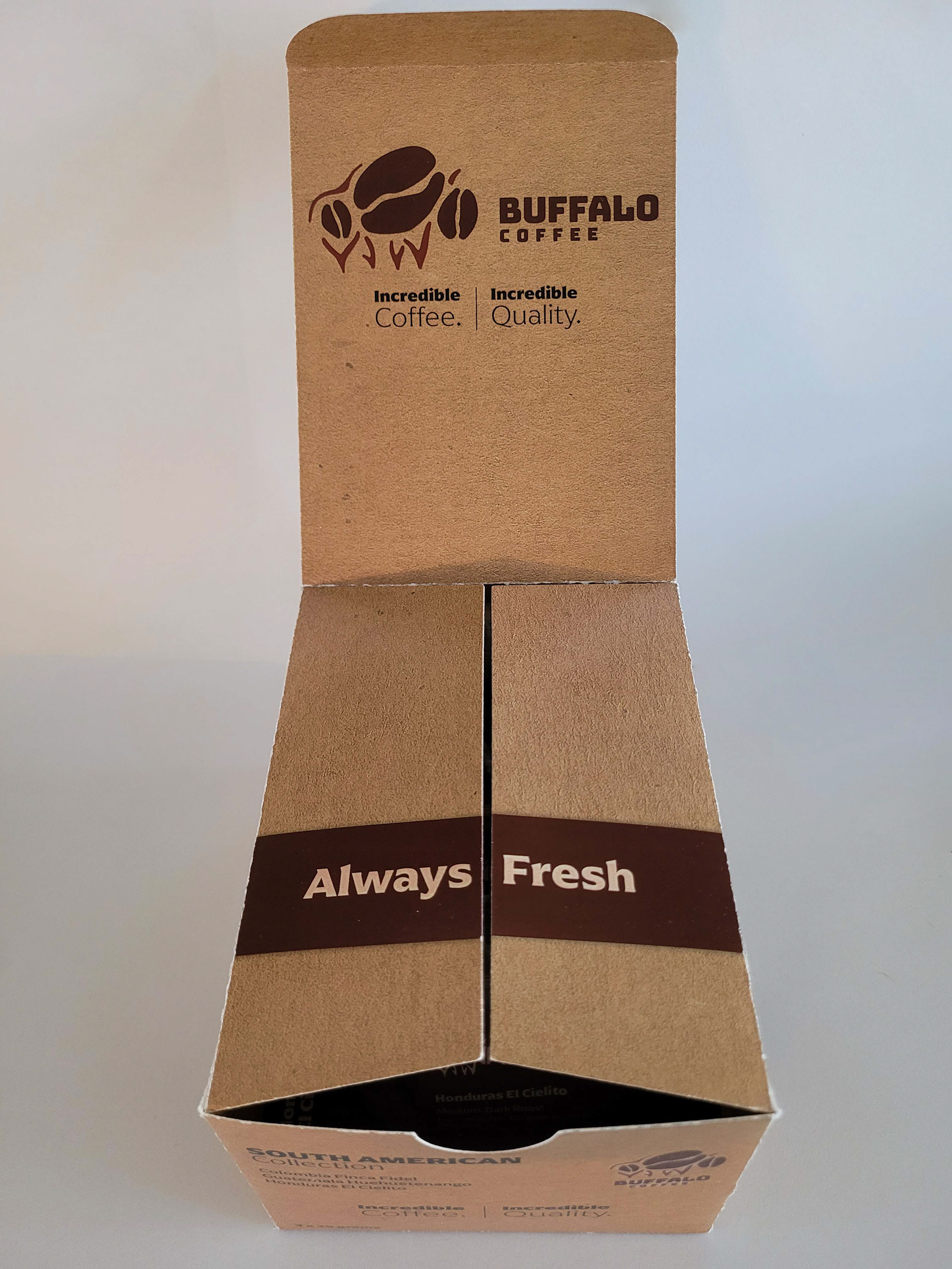
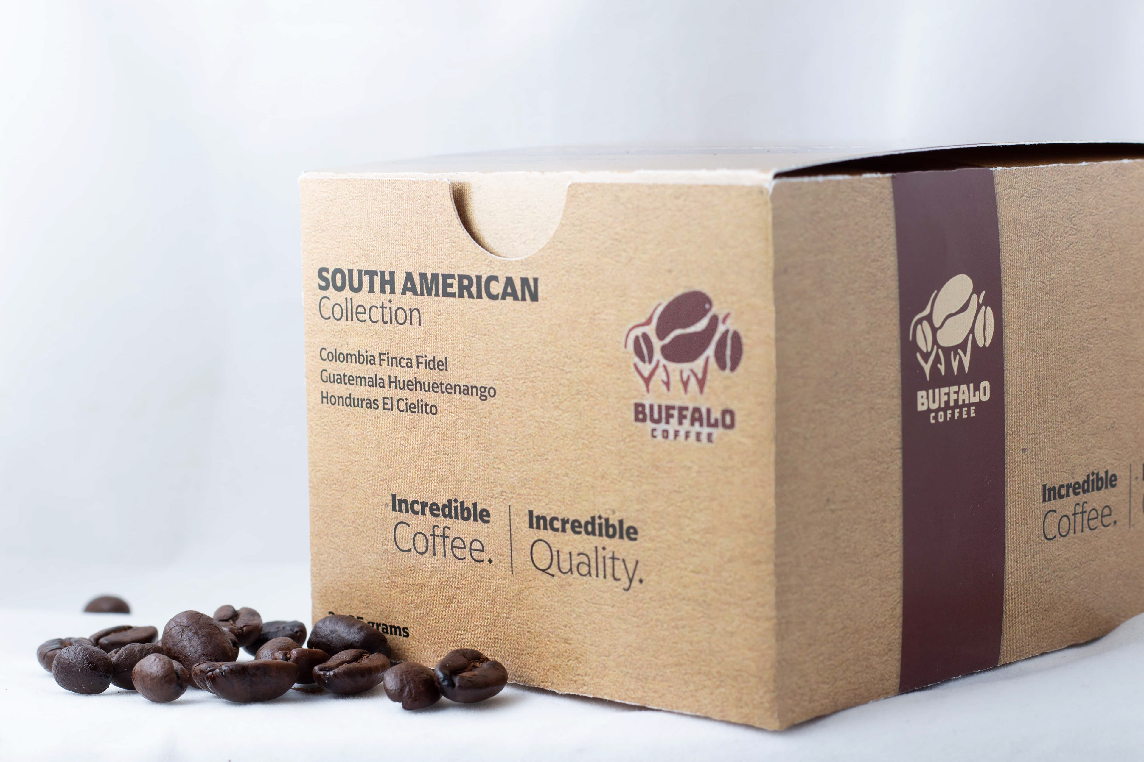
I wanted to focus on the unboxing experience - how the customer would interact with the package and what they saw when they opened it. The client wanted a higher-end look while remaining true to its authentic roots. So I decided to combine elegant typography with a cardboard texture to capture both aspects of the brand.
Results
Packaging design is one of my favourite parts of graphic design - I like that you get to solve problems in 3D and not just on the page. I think this project came together really well and ended up being a good representation of the brand and is an engaging experience for the customer.